
 In 1991, a groundbreaking and forever influential album was released by a then-unknown band called Nirvana, led by guitarist and lead singer Kurt Cobain. When that album appeared on the music scene, it was during a time when rock music was, in many respects, dead. Not to say that rock albums weren’t selling; for about a decade prior to that time, the rock music scene was dominated by Glam metal bands (also known as Hair metal bands) like Def Leppard, Warrant, and Poison.
The raw and unassuming sounds that were introduced by Nirvana and subsequent grunge and alternative rock bands like Pearl Jam, Stone Temple Pilots, and Soundgarden were a long-awaited change. Rock fans were tired of poseurs and sexist music that had no substance and little in the way of a positive message. The glam trend died and true rock music was starting to be revived.
Unfortunately for rock fans, that revival didn’t last long. Soon, the grunge and alternative rock scene became as superficial and poseur-like as the original hair bands that dominated the mid-to-late eighties. By the end of the 90s, and into the 2000s, bands like Creed, Nickelback, and 3 Doors Down attempted to follow in the footsteps of their grunge forefathers, creating what ended up being poor imitations of the grunge sound and fooling millions of listeners into thinking that the music industry had actually evolved and moved on from its superficial past.
 Nirvana != Nickelback But nothing could have been further from the truth. Although, on the surface, it was not evident (and might still not be evident to some people) that this new scene of music resembled the bubble gum rock of the eighties, upon closer examination, the grunge scene had become just as trendy, and just as shallow. Nickelback, in particular, was mercilessly exposed for its cookie-cutter style of music.
If you don’t believe me, have a listen for yourself.
What on Earth Does This Have to Do With Web Design?
And this brings us to the problem we now see in the web design industry. Could it be that the trends we’re participating in and speaking so highly of are making the current state of the industry resemble the superficial, unusable, and bloated websites of the past — similar to how the so-called grunge and alternative bands in the post-Nirvana era resembled the glam rock bands of the late eighties?
Let’s consider a few examples to demonstrate how we could be suffering from some of the same problems.
Modern-Day Hit Counters
It’s been understood for years now that putting a odometer-style hit counter on a web page is (to put it bluntly) pretty lame. No self-respecting web developer today would even consider doing such a thing, even if a client demanded it.
I can tell you right now if any client told me to put one of those on their site, I’d kindly refuse even if it meant losing the client. Some things are just not worth the money.  Today, we see a similar trend: a website’s total number of Twitter followers and/or RSS subscribers proudly displayed in a sidebar or website header for all to see.
The Twitter buttons below are from Twitter Counter and are just one of many customizable examples of Twitter count widgets out in the wild.  You can also easily display your RSS feed count through a service like Feedburner, which allows you to install a “chicklet” feed displaying the number of your RSS feed subscribers. If you really think about it, is this really any different than the ever-hated hit counter?
Do we want to follow someone on Twitter just because they have 30,000 followers? Does the follower count really indicate an increased quality in tweets? Personally, I’d rather follow someone who has 50 Twitter followers and is an expert willing to share and discuss their work, as opposed to someone who has tons of followers but doesn’t have much to share that’s valuable in my field.
This is not to say that a large Twitter feed following or RSS feed subscribership automatically points to poor feed quality. I just don’t think the practice of displaying Twitter and RSS feed counts has any real user-centered value. Quality of content is the primary reason people subscribe to a website’s feeds.
If they’re subscribing for any other reason, then you probably don’t want them subscribing. The Twitter and RSS subscribership counters are really just a new-and-improved version of the hit counter odometer.
Modern-Day Animated Splash Pages
Another superficial and often pointless web design trend from the yester-decade of the 90s was the splash page.
Sometimes it was a static page, but often, it was a bloated and self-indulgent animated intro (and occasionally with techno-music playing in the background). Eventually, website owners realized that they didn’t want returning site visitors sitting through the same animation on each visit to their home page.  An example of an animated Flash splash screen. But instead of doing the sensible thing and eliminating their splash pages, they began adding “skip intro” links to these unwatchable annoyances.
Unfortunately, these (and similar) trends still exist in certain website niches. But things have generally improved. Or have they?
Today, many developers are building sites and experiments using cutting-edge CSS3 and HTML5 techniques. There are HTML5 and CSS3 experiments, and some pretty impressive Canvas demos. I think these are great for the developers that coded them because the experience and knowledge they’ve gained will further their own understanding of these future W3C-recommended standards.
But, in most cases, these experiments and demos have little real-world value.  The now-famous CSS3 Spider-Man animation. The CSS3/HTML5 Spider-Man experiment shown above is a powerful demonstration of what’s possible without Flash. But how practical or reusable is it?
I think I echo the remarks of the commenter shown below who was evidently making a sincere inquiry:  A comment regarding the CSS3/HTML5 Spider-Man experiment. In particular, taking CSS3 techniques “too far” was discussed by Matt Ward of Echo Enduring Media (also a Six Revisions contributing writer), which he was motivated to write after reading this article by Faruk Ate?. What’s interesting about Ate? is that in his website bio, he refers to himself as a design and development “consultant”. I think this is significant, because it’s people like him that are in the business of advising on design and development decisions who can objectively evaluate a trend or technique and recognize it for what it really is. In both those articles, the authors remind us to remember the importance of practical, reusable code. Unfortunately, even some simple CSS3 enhancements that seem harmless can bloat our CSS and make it much more difficult to work with.
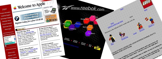
Modern-Day “Best Viewed With” Badges
Here’s another trend from years ago that I thought we had put to rest. In the past, “webmasters” used to develop websites specifically for a single browser, particularly during the mid-90s browser wars. Many sites would embed a badge or other kind of notice informing the visitor that the website was “best viewed with” either Internet Explorer or Netscape.
![]() An old site with a Netscape and Internet Explorer “best viewed with” badge. Today, a whole slew of websites, demos, and experiments are doing essentially the same thing. Even my own CSS3 chart suffers from this problem.
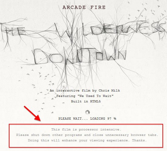
An old site with a Netscape and Internet Explorer “best viewed with” badge. Today, a whole slew of websites, demos, and experiments are doing essentially the same thing. Even my own CSS3 chart suffers from this problem. 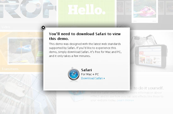 Apple’s HTML5 Showcase is best viewed with Safari. And how about the message shown below, taken from The Wilderness Downtown experiment?
 How about projects such as the ieSucks jQuery plugin (implementation shown below)?
 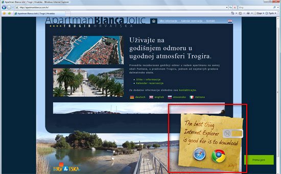 The example site above, when viewed in Internet Explorer, displays a message telling users what browser they should use using the ieSucks jQuery plugin. Is this any different from what we saw back in 1999? In many ways, it’s actually worse.
Another practice that I think at this point we’ve mostly done away with — and good riddance because it really is pointless — is the habit of putting a “valid XHTML” link or badge in a footer or sidebar. Good developers understand that a valid page doesn’t necessarily mean the code is efficient and maintainable and that the content is accessible (read about the issues and limitations of W3C validators). Likewise, an invalid page doesn’t necessarily mean the code is inefficient, hard to maintain, and that the content is inaccessible.
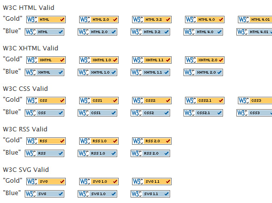 Validation badges for everything. Do they really help promote standards? I understand the importance of promoting standards, but I think that method of promotion has been played out. Fortunately, most developers recognize this so it’s not nearly as common as it was a few years ago.
I just hope there aren’t any “valid HTML5” badges on the horizon. Or maybe the new trend will be a more marketing-friendly badge that says “Invalid CSS/HTML due to cutting-edge CSS3/HTML5 techniques”. Let’s hope not.
Modern-Day Bloated, Cut-And-Paste Scripts
Around the time when IE6 was first released, client-side scripting was starting to take off, and larger possibilities were being opened. It became increasingly simple to grab a script off a cut-and-paste script repository website and just modify it to your needs.
In fact, the first shopping cart I ever built was done completely in bloated impossible-to-imagine JavaScript that I downloaded off one of those sites. Many of these sites stillexist. While this was of great help to web developers, it soon made the code on many sites bloated and difficult to maintain.
Viewing the source on these pages revealed the horrors that these projects contained — code-forking, IE-only scripts, <head> sections that went on seemingly forever, and inline event handlers that triggered them. Do we see something similar today? On some level, we do.
While JavaScript frameworks and libraries have helped us create cleaner code that’s easier to maintain, the [insert-your-script-here] trend hasn’t really changed. View source on any website, and you’ll often see something like what’s depicted in the screen capture below (which is from a real site): 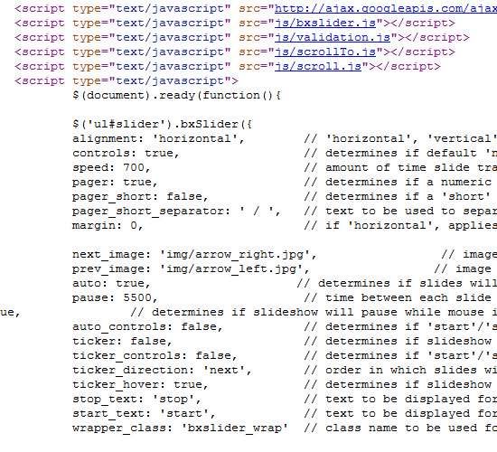 In the above code, after the jQuery library is included, a number of jQuery plugin libraries have been referenced, followed by some code added to the
 <head> of the document that goes on for about 160 lines! Yes, the code is much cleaner and easier to read than was the case back in the days of cut-and-paste JavaScript.
But there are too many HTTP requests, and too much code is not in an external document. So, although the methods used today are theoretically better, the real-world execution of these methods — which is to cut-and-paste code — is often no different. I think with a little bit of forethought, some of these problems can be minimized.
In many cases, scripts can be combined, minified, and namespaced to make the code more efficient and much easier to deal with. Of course, for some projects, there’s almost no way to avoid using multiple plugins. Very few developers will take the time to write (or learn how to write) their own content sliders or “light boxes“; there are too many customizable versions of those things available to use for free.
But the situation can improve if developers take the time to learn how to optimize the code they’re working with — even if it’s not their own code. I’m certainly not immune to these problems myself, so I’m starting to look for ways to make my code more clean and efficient.
Modern-Day Scrolling Marquees
Remember the <marquee> tag?
It was an eyesore and was the butt of many web design jokes for years (along with <blink>). Interestingly, although <marquee> is a non-W3C-standard element, it actually has very good cross-browser support. 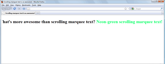 Firefox 3.6 supports the
 <marquee> tag. Again, this is one of those things that it’s safe to say we’d sooner quit our jobs than use.
Or would we? While scrolling news tickers and other animated data feeds have thankfully become old-school bygone trends, we now have a different breed of marquees and scrollers: Twitter streams in sidebars and footers. Sometimes they’re pretty simple, consisting of just a simple box or bubble displaying the last tweet.
In other cases, they’re more obnoxious, showing multiple out-of-context tweets, scrolling up and updating at specified intervals using Ajax. The demo shown in the screenshot below is one example of a jQuery plugin that helps you easily add a Twitter stream to your site: 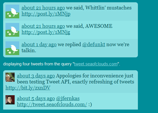 The Tweet jQuery plugin displays a marquee-like scrolling Twitter feed on your site. As in the case of tweets in the above demo, not many Twitter streams will provide anything of practical value when displayed in the context of a full website. Even on a personal blog, this kind of thing seems to have little practical value, especially when you consider that Twitter streams often contain messages that are really only intended for a single individual or a particular group of people.
I visit hundreds of web pages every week, and it’s extremely rare that someone’s last tweet (or last five tweets) interested me so much that I clicked to read their Twitter stream, or followed them. An animated auto-updating Twitter stream is not going to entice me to follow you; good content on your website is. I guess the principle here is: If we’re so against auto-playing audio and video, why aren’t we against “auto-playing” Twitter feeds?
Okay, Maybe It’s Not So Bad
After considering all of this, I still think we’ve come a long way since 1999, and even with some of these questionable trends, the web design industry is still in great shape and will continue to move forward and innovate. The ugly odometer hit counter has been replaced by simpler and more elegant feed count displays. The superficial Flash intros have been replaced by educational and forward-thinking experiments.
Bloated cut-and-paste scripts have been replaced by cleaner, more maintainable code. And the scrolling news tickers and marquees that sometimes spanned the entire width of a website have been replaced by less-obtrusive Twitter and RSS feeds. Nonetheless, consider this a warning to encourage the community to avoid taking these things too far.
Let’s work at creating a cleaner, more accessible, and more efficient web of content. Let’s not let HTML5, CSS3, and social media become the Nickelback of web design.
Related Content
-
 President of WebFX. Bill has over 25 years of experience in the Internet marketing industry specializing in SEO, UX, information architecture, marketing automation and more. William’s background in scientific computing and education from Shippensburg and MIT provided the foundation for MarketingCloudFX and other key research and development projects at WebFX.
 -

WebFX is a full-service marketing agency with 1,100+ client reviews and a 4.9-star rating on Clutch! Find out how our expert team and revenue-accelerating tech can drive results for you! Learn more
Make estimating web design costs easy
Website design costs can be tricky to nail down. Get an instant estimate for a custom web design with our free website design cost calculator!
Try Our Free Web Design Cost Calculator
Share this article


Web Design Calculator
Use our free tool to get a free, instant quote in under 60 seconds.
View Web Design CalculatorMake estimating web design costs easy
Website design costs can be tricky to nail down. Get an instant estimate for a custom web design with our free website design cost calculator!
Try Our Free Web Design Cost Calculator


