Virtually every website that has more than a few pages uses some structure for organizing the content. The most common (and most easily understood) structure is to categorize pages into groups, often with distinct subgroups. The end result is a hierarchy of content, a structure familiar to most of us from our interactions with organizations, families, and the natural world.
Decisions about exactly how content should be grouped can have dramatic consequences for how your site's structure works (or doesn't work) for users, but these nuances are difficult to understand at first glance. To analyze how a structure will work, we often need to create a visualization that shows a high-level view of how the different pages of a site relate to each other.
Consider these 2 structures: each represents the same amount of information, and shows a perfectly logical way of organizing the content for a website. Yet the end-user's experience of browsing these 2 hierarchies — even if they contain exactly the same information — will be very different.
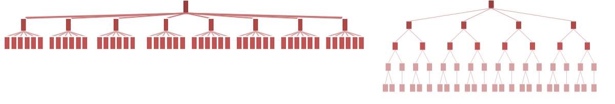
Although website visitors never see this type of visualization, the shape of the hierarchy has a huge impact on the end user's experience, for 2 reasons:
- Content is more discoverable when it's not buried under multiple intervening layers. All other things being equal, deep hierarchies are more difficult to use.
- Categories that are specific and do not overlap are the easiest to understand. This cuts both ways: In deep hierarchies, when there are only a few categories on each level, they tend to be more generic and, thus, more confusing. A flatter hierarchy with more categories at each level usually has more-specific labels that are easier to understand; but in broad hierarchies with a very large number of items, there is often some conceptual overlap between at least a few of the categories. Users can also become overwhelmed with long, cluttered menus.
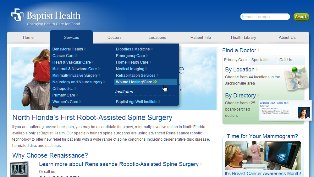
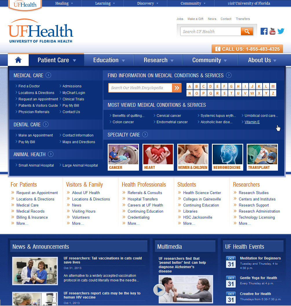
Three hospitals in Florida illustrate the benefits and pitfalls of different information hierarchies. On the website for the Tampa General Hospital, the Medical Services category lists 32 separate disease areas and treatment centers. This flat hierarchy makes it very easy to discover what kinds of treatments the hospital offers. Visitors can click directly from the drop-down menu in the global navigation to a page that addresses a specific disease. Since most patients are treated for one thing at a time, jumping straight to information about a specific condition is attractive. But the risk with this type of menu is that users may be overwhelmed by so many links, fail to read the whole list closely, and miss the best option. For example, a visitor interested in neonatal care might easily overlook the link for the Jennifer Leigh Muma Neonatal Intensive Care Unit, and end up clicking the Pediatric Center at Healthpark instead. Lists this long can be made easier to scan by providing some grouping — not pushing some items down into sub-categories of the hierarchy, but simply visually organizing related items together.


Representing Hierarchies in the Interface
With flat hierarchies, it's relatively easy for users to understand how any given page relates to other pages, as long as there are some visible navigation menus. But the deeper a hierarchy becomes, the more likely visitors are to become disoriented. For sites that are more than a few levels deep, breadcrumbs (which show a link for each level of the site from the homepage to the current page) can help users orient themselves and understand the site structure. Sitemaps are another useful way of helping users see the structure of a website.
Flat or Deep?
Should your website's hierarchy be flat or deep? Like most design questions, there's no single right answer, and going too far to either extreme will backfire. Flat hierarchies tend to work well if you have distinct, recognizable categories, because people don't have to click through as many levels. When users know what they want, simply get out of the way and let them find it. You can use card sorting to help decide how to structure the information in the way users think about it. Tree testing can help validate the structure by allowing users to attempt to find information in the proposed hierarchy.
But there are exceptions to every rule. In some situations, there are simply too many categories to show them all at one level. In other cases, showing specific topics too soon will just confuse your audience, and users will understand your offerings much better if you include some intermediate category pages to establish context.
Observing your users — via usability testing, analytics, and search logs — can help you understand what problems your audience needs to solve and how familiar users are with your content. This background knowledge is essential to achieving the right balance between a breadth and depth in your hierarchy.