A picture is worth a thousand words, even if the picture is a 16×16 pixel favicon. The favicon (also known as favorite icon) has been a part of the Internet, albeit a small one since the release of Internet Explorer 5 in 1999. Originally it was only shown in Internet Explorer’s favorites (bookmarks) menu and next to the URL in the address bar if you had the page bookmarked. Coincidentally this allowed webmasters to estimate the number of users to a page by the number of requests made for the favicon. This no longer applies since modern browsers display favicons without the need for bookmarking. You can read the story by one of its creators here.
Today’s favicons are often used as an extension of a company’s branding within a web browser, and to help users navigate their open browser tabs quicker. Sometimes a favicon is a shrunken version of the company’s main logo.
This little element can be used to extend the functionality of your website and/or create interest.
While unimaginative, it does a very good job of extending the brand and makes it easy to distinguish the different tabs in your browser. However, there is a lot more you can do with favicons. The most effective favicons can communicate the brand, company and current webpage all within an extremely small amount of space.
Favicon Design
The small 16×16 pixel space is both a limitation and a creative spur. It is difficult to create an icon that communicates the qualities listed above, and keep it small enough to fit inside a 16×16 pixel space. Favicons are underutilized, which means designers often regard them as unimportant, therefore they don’t really spend much time designing a great favicon.
![]()
Chanel’s logo looks great as a favicon because the logo scales well and still gives off the feeling of luxury and class. Effective favicons that are just shrunken versions of the main logo are more a testament to the design of the main logo, than the design of a great favicon.
Due to the small space, geometric shapes and simple typography work best.
Intricate designs usually don’t work since the detail is lost and it becomes a blob. For example, the Starbucks favicon is just legible while favicons using the Pizza Hut and Virgin logo become a bit hard to distinguish.
The most common color for favicons is red and blue. This is not surprising as most companies use these colors in their branding. About half of the most popular companies use no letters or numbers in their favicons, and about a third use one letter or number.
1- Using Favicons to Distinguish Between Production and Development Environments
A concept you can apply to your own work is to use different favicons for separate development and production environments. This can help you determine whether you are working on the live site or the development environment. Using this concept you will delegate different favicons to whichever version of your website is making the request.
This an example taken from Michael Mahemoff’s post.
The code and technique is detailed in Michael’s post and provides a step-by-step guide on how to implement it on your own website.
2- Creative Favicons
If you have ever tried to design a logo, you will understand how difficult it can be to use one visual to communicate everything about a product or company. This is no different to designing a favicon. The size limitation also adds an extra challenge since you can’t use taglines, written text or huge amounts of detail. But many companies are still able to create interesting little graphics that enhance the experience of their webpages.
Youtube
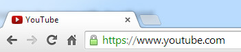
YouTube’s favicon is an example of a creative yet simple design. It is a variation on their established branding and main logo. Instead of shrinking their entire logo as a favicon they have taken the iconic red box that surrounds the word “tube” in their logo, and replaced the text with a play icon. Anyone that sees this instantly recognizes that the webpage will contain music, video and other playable media. The favicon also changes depending on the current state of the video. It will show a paused symbol when the video is paused.
Sitepoint
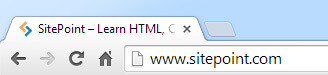
Another example of a website using a creative favicon is SitePoint. Their favicon forms a S with two angled brackets, a set of characters which is commonly used in web development and programming languages. The use of yellow and turquoise is a tribute of sorts to their old web design which featured these two colors heavily. Any web developer should quickly see the connection between the company, webpage and favicon.
Trello
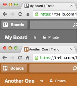
Trello’s favicon indicates the current background color you are using and also works for custom uploaded backgrounds too.
Mixcloud
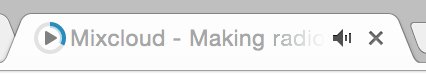
Mixcloud dynamically updates the favicon to represent if the track is being played or paused. It also updates the favicon to show how far into the track you are.
Github
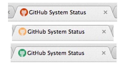
Github’s little mascot favicon changes color depending on the current system status.
Flickr
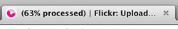
Flickr displays a live favicon indicator when you upload a photo, showing you the progress of your upload.
3- Animated Favicons
We don’t often see animated favicons because they are distracting and difficult to pull off. Animated favicons are more often done poorly rather than done well. They are very hit-and-miss, if the animation is too subtle it won’t be seen, but if it is too prominent than it distracts from your webpage. It can be very difficult to find the right balance, and not all designs will animate well either.
![]() Antilimit animated favicon
Antilimit animated favicon
4- Dynamic Favicons
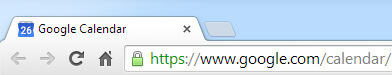
A more useful approach to interactive favicons is the use of dynamic favicons. Although the majority of online webpages and web applications are not currently using dynamic favicons, it could become the standard in the future. Gmail currently shows the number of unread emails in the favicon space and dynamically updates whenever you receive a new email. And the Google Calendar favicon shows the current date and updates everyday.
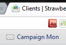
Another example can be seen with the app Campaign Monitor. Changing from a closed envelope when logged out to an open envelope when logged in.
These dynamic notifications extend the functionality of the service but still maintain consistent branding. It would be a great feature to have on other services such as Facebook and Twitter. We’ve had the technology and methods to create dynamic favicons for at least over a year, but unfortunately the favicon is an element that is considered unimportant. Therefore no one really puts in much development time or attention to them.
To create your own dynamic favicon or to experiment with favicon notifications, try the “Notify Better.js: Creating a Dynamic Favicon and Title” tutorial by Onextrapixel.
5- Games With Favicons
Web developers have done some crazy things just for the thrill in the past, and the manipulation of favicons is no exception. Here are two examples of crazy projects that developers have created involving favicons.
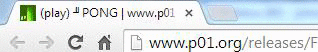
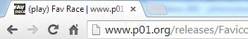
Mathieu“p01” Henri created two fully playable games that run within the favicon space in your browser. Built using canvas and JavaScript, each frame of these games is generated by JavaScript. These images are then converted to PNG imagse that are used as the favicon. One of these games is a recreation of the classic “Pong” and the other is a racing game called “Fav Race”.
Due to the size limitation of favicons, the game has to be super simple but it does show what is possible with favicons
Overall the use of favicons is very rudimentary and the medium is largely unexplored. Due to the size of favicons, many people don’t find it worth the time to invest into new developments or designs. However, with a few dynamic scripts and functions you can already see the benefits of using creative favicons. Dynamic notifications could be the next first step in the evolution of the favicon, and with the example of “Defender of the Favicons” there is so much more we can do with a small space.
“Can’t mention this enough: For web/UI designers, Placeit is a great online tool”
Six Revisions 5/5
Designing the Perfect Page Is Not the End of the Road
Now that you are done with the technicalities and final touches of your page, it's time for all your hard work to see the light. The web design industry is one of the most competitive businesses out there and to be able to make your website stand out from the crowd you must learn to promote it like the pros.
Learn how to make the most of your product on our App Marketing category in the blog, from making mockups and demo videos to promoting on Facebook and uploading the right iOS screenshots to iTunes Connect, we've got you covered.

1 Comment
Placeit
Love it!