It’s no surprise or secret that ecommerce has gained popularity and expanded in the last ten years or so. Companies like Amazon and Alibaba are now global monoliths and it seems that there’s a new eBay-like site popping up every other day.
Sadly remarkably few of these sites take the time to consider the very different UX needs that ecommerce sites present though.
So, if you’re in the process of developing an ecommerce site for a client or company, read on and discover some of the considerations you may need to take to make its UX seamless and awesome.
The Product
Let’s start with what must be the most important aspect of any ecommerce site: the products. They’re the site’s selling points (literally), so making sure that their part in the user experience is spot on will be key.
Making your product images bigger is one trend that has been gaining traction, and for good reason. People shop with their eyes, and the web is no different; big, detailed images allow customers to peruse your wares before committing to them, which means you deepen the level of trust between your site and user.
Interestingly, though, this only seems to be the case when looking at products for which the physical condition or appearance can influence the buying decision.
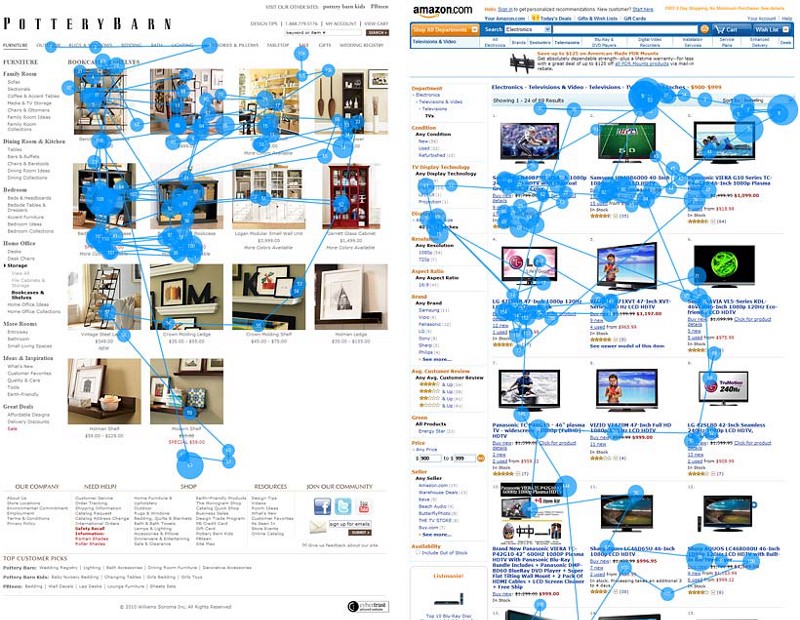
The eye-tracking study done by the Nielsen Norman Group above shows how users react differently to images on two different sites. When viewing book shelves on the site on the left, users’ attention is focused largely on the images, whereas those considering a new flat screen TV were less concerned with what it looks like and focused more on the technical specs of the product.
Here, it’s a good idea to make sure that the technical specifications are front and centre, and easy to scan, giving the user an easy way to differentiate and make their choice.
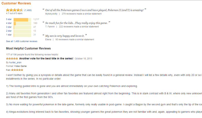
The Reviews
Review are another key factor of your product pages, and I think it goes without saying that this is an important part of any ecommerce UX.
As people we tend to distrust faceless corporations, especially when we’re interacting with them in a non-physical manner like the web, because it makes us feel less in control. The opinions of others like ourselves, though, helps give us confidence in our purchase decision.
So, user reviews give us that extra sense of security when it comes to buying something. The effect is even more pronounced if the site has high traffic and a “X number of people found this review helpful” type ranking system, such as Amazon. Remember, the key in every ecommerce system is to build trust with the user.
The Cart
Another one of the most vital aspects of any ecommerce experience, the shopping cart is often neglected or thought about in the wrong way when it comes to UX.
The act of adding something to my cart, a very important action, is often seamlessly integrated into the experience (a process increasingly referred to as ‘slippy’ UX).
This sounds like a good thing, until you think about the fact that I’m potentially spending a large amount of my hard-earned money on a product, and have no idea whether it’s actually gone into my shopping cart or not.
At best, I have to search the screen for the often obscure cart icon (another thing that makes little sense) to check whether the product has actually been added or not. At worst, I’ll assume it wasn’t added and end up clicking ‘Add to Cart’ again, meaning I’ve now accidentally bought two of the same product.
Takealot.com, a leading ecommerce site in South Africa, has this exact issue. Adding a product to my cart gives no feedback, and I’m left having to search for the obscure cart icon somewhere in the top right of the page to make sure I’ve done something.
One thing Takealot does get right, though, is the cart itself. Research has found that many users use their cart less like a physical shopping cart and more like a ‘wish list’, using it to help make decisions before actual checkout.
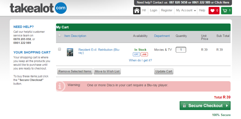
Takealot’s cart helps with this process by giving the user a rundown of their products with applicable images (again, important for some products). It also gives you an easy way to remove items from your cart (handy, given their opaque add-to-cart process) and, perhaps most important of all, doesn’t require the user to login until actual checkout.
Perhaps most impressively, the Takealot cart even warns you of any necessary dependencies a product might have — for instance, a Blu-Ray disc requiring a Blu-Ray player.
In that last case, one might even improve the UX by placing a link to Blu-Ray players available on the site, giving the opportunity for the user to add one to their cart immediately.
Artificial Intelligence
This is a feature rarely seen so far in the world of ecommerce, but it’s gaining speed, with many larger ecommerce companies actually devoting teams to developing their AI systems.
Giants like Amazon use it frequently and it improves the UX drastically. By taking note of what users are looking at, what they’ve purchased in the past, and what similar users have been interested in, they’re able to build a system devoted to helping each user in their retail quests.
As a user, you’re given the impression that the site is tailor-made to suit your tastes and, in fact, increasingly it is.
Below is what greets me when I go to amazon.com, and I’d venture to say it’s very revealing of my tastes as an individual:
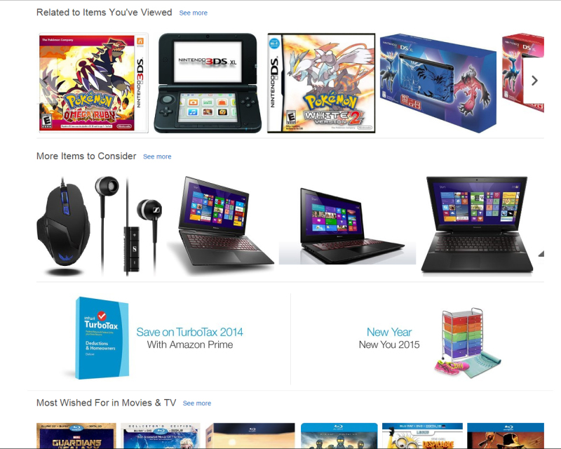
Best of all, it does this even if you’re not logged in (which is also slightly creepy). I have a feeling that this type of UX will make its way to a more mainstream set of ecommerce sites in the future, though, so keep your eyes open for this one.
Conclusion
The UX of an ecommerce site is often more important than any other site because it is a direct interface with business and users’ money.
A carefully crafted system with a considered shopping cart, user reviews and product pages can go a long way to easing the user into making a buying decision.
If available, an AI designed to complement these considerations can take your ecommerce site from great to incredible, but even without it you can ensure an online shopping experience that ends up being beneficial for everybody.
Further Reading
 Byron Houwens
Byron Houwens is a designer and developer who enjoys focusing on front end technologies and UX. He currently works as a front end developer in the burgeoning edtech environment, and lives in sunny Cape Town, South Africa.