The Web is full of success stories. To balance things out I’ll share 5 case studies of website redesign failures (including the story of one of our colossal fails). Let’s start with how we redesigned one of our services and lost almost half of user engagement in the process.
Before Website Redesign
We draw icons. At the very start of Icons8, it became obvious that we weren’t able to hack Google AI to invent hundreds of icons every month, so we needed some help. Who better to turn to than the people that actually needed these icons – our customers! That’s how the Request Icon feature was born 3 years ago.
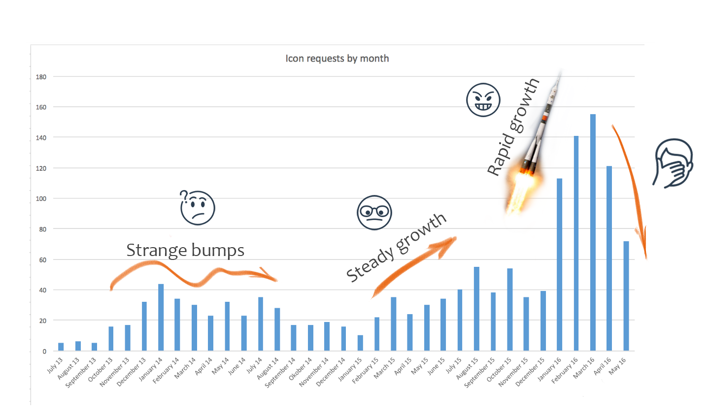
For the last 3 years it looked like this:
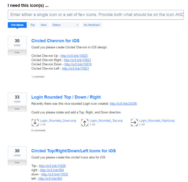
The idea is simple: people request the icons they need and other people vote for them. We draw the most popular requests. Every day. And it’s working.
“Request Icon” lifecycle
This demands some explanation.
Strange bumps
We went back and forth with adding/removing an Ideas&Votes link from our main menu. It never got great results except for short-term popularity bumps. Basically, it meant that old clients who knew about this feature before were reminded about it and gave it a second go.
However, new people who never expected requested free icons ignored the menu.
Note. We tried to rename – Ideas&Votes to “Request icons” with the same result. Second bump. Based on our usability research, people tended to ignore the feature based on a set of incorrect expectations. (“It is expensive”, “It’ll take a long time”, or “It’s some kind of scam”)
Steady growth
Well, that’s easy. Icons8 overall traffic showed steady growth during the same period of time which led to some proportional growth of the feature’s popularity.
The red dashed line is the actual traffic. We had some analytics tracking problems so half the traffic just vanished from the chart.
Rapid growth
Apparently, it took us a few years to realize that the best time to fulfill a need is right as it arises. Just like people forgetting to buy milk while shopping, they forgot about the menu link when they needed an icon.
The decision was obvious. This one:
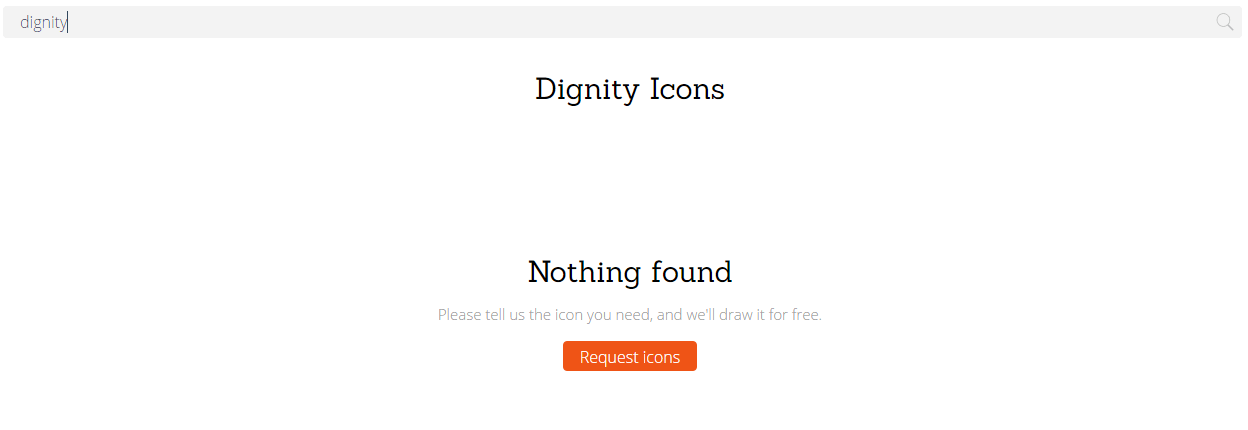
Lost your dignity? Ask us, and we’ll draw it.
comparted to:
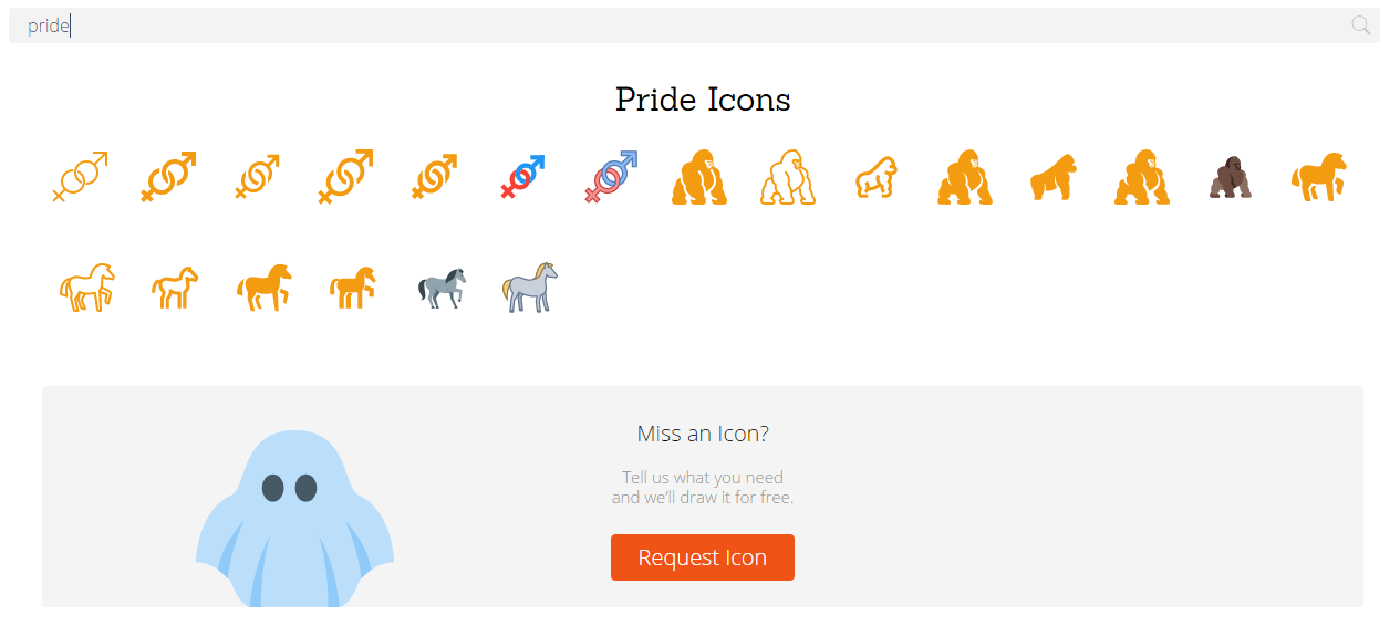
Can also help you with pride.
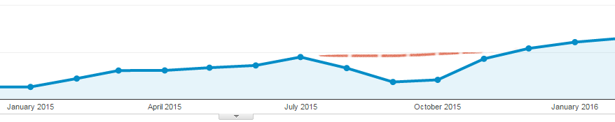
To be honest, the graphic below is pretty much useless. I just think it’s pretty, so it’s staying in. The “miss an icon?” hint was launched on January 18, 2016; and provided us with 75 people on a daily basis using the “request icon” feature.
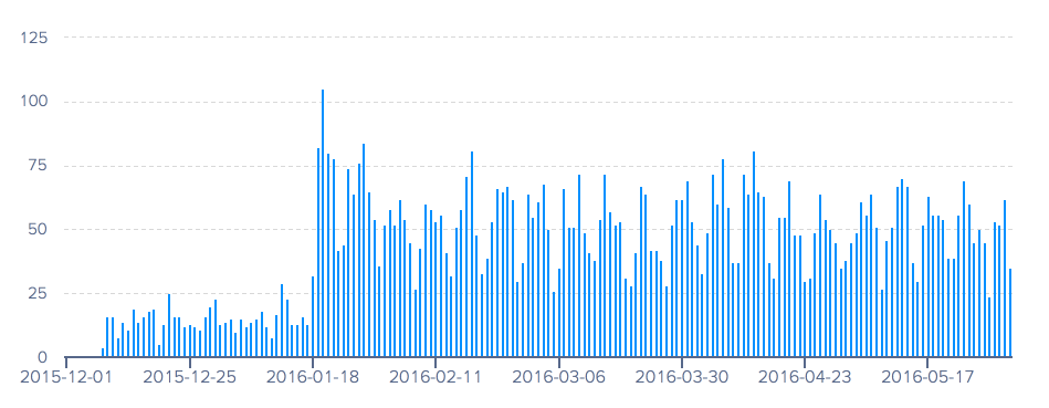
January 12 to 18 shows how devoted our programmers were in testing things.
Everything was great. Until we decided to make things even better.
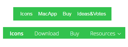
After Website Redesign
After the redesign, the feature looks like this:
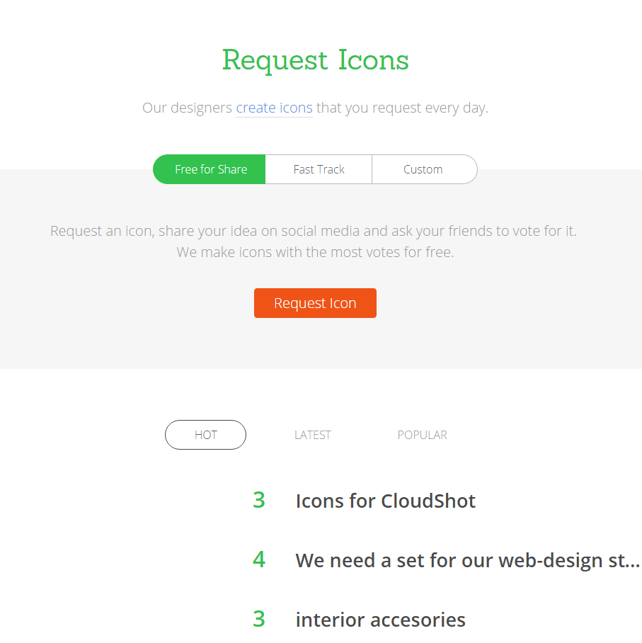 The intended goals of the redesign were:
- Add 2 new features – fast track orders and custom orders
- Replace an old design, making it minimalistic and modern
- Save our designers time they wasted on administrative tasks
What did we actually achieve?
- 50% drop in user engagement for requested icons
- 50% drop in user engagement for votes
- I was forced to conduct usability studies
Important: our overall traffic didn’t change. The same amount of people visited this feature’s page. We definitely improved the overall “look” of the feature but lost a few good bits on the way.
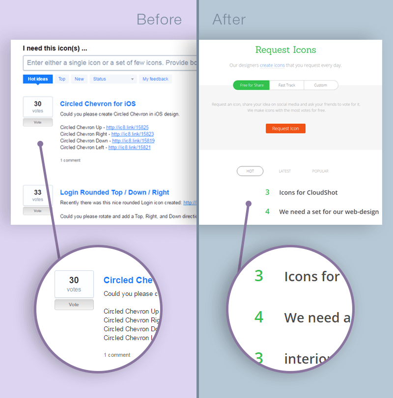
Note that descriptions are visible in the old design, while hidden in the new one. I’ll write more on this later.
50% drop in user engagement for requested icons
People requesting icons need to know 2 things:
- Does this “request” thing really work?
- When will they get their icon?
The thing is, the old design answered the first question and the new design answered the second one. Seems like if you don’t want a ~50% drop, answering the first one should be the top priority.
This is one of the fewer things that really add something to the feature after the redesign.
To answer Does this “request” thing really work? we use Votes and Comments.
Votes
Voting means that it has a life of its own. People vote, there is a queue, and it’s moving. So the feature IS working.
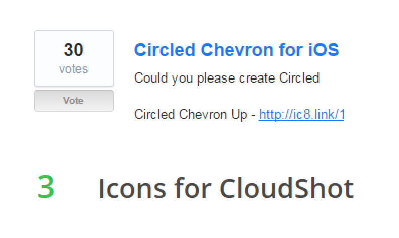
That’s the critical difference between the two designs. In the old design, I immediately understood that the number meant votes.
Old design:
- Number of votes
- Text hint “votes” below the number
- Both number and text are enclosed in a square, forming a symbolic representation of an empty icon. I have the feeling that someday there will be an icon instead of digits and “votes.” It’s a very smooth, tiny detail, but has such an impact on the overall impression.
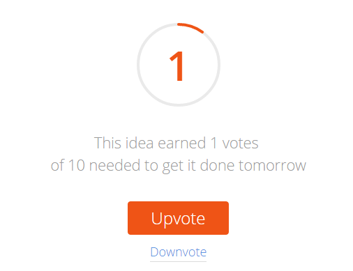
New design:
- Some number
- Some text
Voting arrows appear only on mouseover. A big NO-NO.
What is this digit supposed to mean? Position? ID? Days left? Without knowing what the digits mean we can’t be sure if the request service is working.
Comments
Another sign of life is the comments. We’ve used them to comment on the status of an icon, but people were actually commenting on requests, flattering and bribing each other. The place used to be full of energy and life… until all of a sudden everything was gone.
The new design had no comments — our users were speechless, just like me.
50% drop in user engagement for votes
There is only one big question here, What am I voting for?
In the old design, the average number of votes an icon needed to get in order to be drawn by us was ~30. With the new design, that number was ~15-16. Actually, last time I checked, it was 9. But 70% would be way too dramatic a number for the headline of this article.
Nine votes may seem good for companies with 9 employees, but it could lead to a large number of custom icons being drawn for small, niche projects, not community approved ones. Suddenly all 9-person companies hate me now.
The decrease in average votes is, partially, due to the “voting” problem mentioned above. People won’t vote if they can’t understand the system. Another reason is the descriptions.
Descriptions
Within the old interface, you were able to see the description of every request on the page you landed on by scrolling down, choosing what you liked, then voting for it.
The new interface forced users to click every request in order to see its description. Every time.
The initial motivation to scroll down through many requests, having some fun along the way reading other people’s descriptions and requests, and voting for the ones we liked, was killed. Thus our voting numbers decreased by ~50%.
Solution
Quite easy. We need to bring back the “queue” effect.
To be honest, the new design has a Recently Created Icons section, an indication that the feature is live. However, you need to scroll down in order to find it.
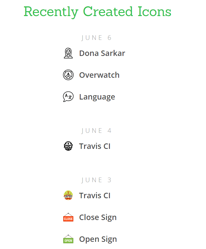
People have no motivation to scroll. If they don’t understand what’s happening on top they have no idea what to look for below.
For starters, here’s a short to-do list:
- Properly indicate votes
- Bring back descriptions of requests
- Making it all visible as soon as people landed on the main page
By trying to make the service simple and minimalistic we complicated user’s experiences. Getting rid of a few tiny details dissolved the whole sense of a queue and availability was lost, leading to a bunch of unanswered questions and reduction of user engagement.
Digg
Digg established itself as one of the most popular social bookmarking websites of the 2000s. But seeing a rapid growth of Facebook and Twitter in 2010, Digg decided to switch focus from social bookmarking to social networking.
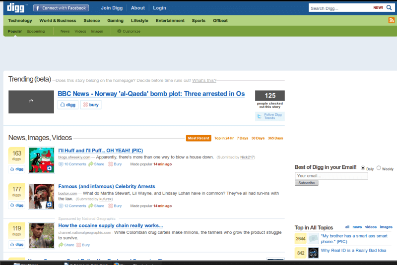
Basically, they wanted to make it easier for users to share content with their friends and follow what their friends have shared.
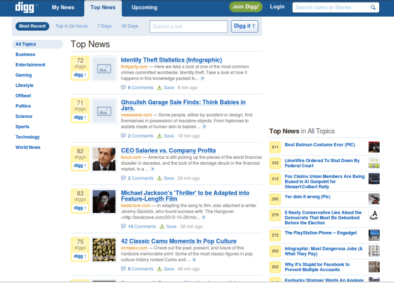
The problem is, by 2010 most people already had accounts in the major social networks and they saw more news than they could gobble up.
One of the early-adopted users summed it up pretty clearly.
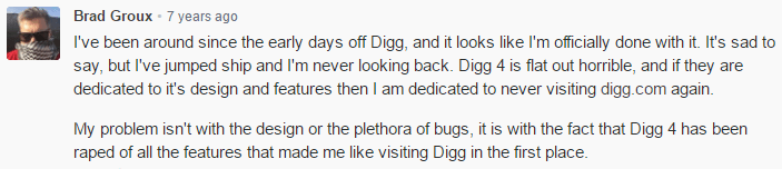
This drastic change in core logic was not taken kindly by the users, and according to reports by Hitwise Intelligence, Digg’s traffic plummeted 26% in the U.S. and 34% in the U.K. Digg called it a “bumpy start” when they sent a message to its community.
By 2012, things had gotten so bad that Digg was sold for $500,000 having been previously valued at around $160 million in 2008. Quite a hit!
Digg made a strong comeback under the new owners, but it’s interesting to theorize what might have happened if Digg didn’t decide to change their strategy which resulted in the redesign of the service.
Marks & Spencer
The British retail giant spent two years and a whopping £150 million on developing a new website. The initial reviews were good. Customers acknowledged a new focus on great visuals, the magazine-style editorial which looks great on tablets.
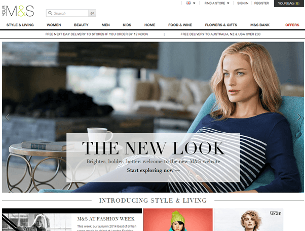
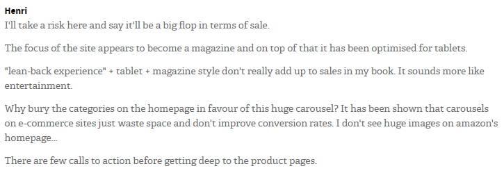
However, there were also customers who were far from impressed with the new design and they raised concerns at both usability and performance issues. Like this person, for example:
There were other complaints as well:
- Having to re-register on the website
- Couldn’t reset passwords
- Navigation poor experience for tablet users
- Lack of detailed product information
- Preventing a customer from completing the selection of a delivery option
Abovementioned issues led to an 8.1% plunge in sales, which resulted in a £55 million loss. In total, Marks & Spencer lost over £200 million.
CNN
In 2015, CNN rolled out a new website design. According to CNN Digital Editor In Chief, the new website will cater to its readers on social media and will become more mobile friendly. The new design will also put emphasis on pictures and videos.
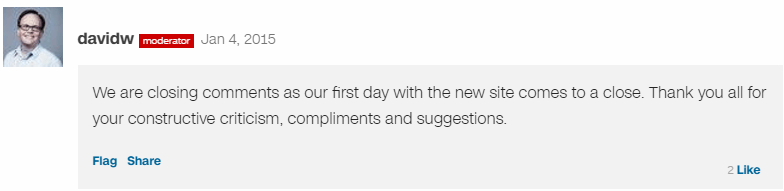
Sounds great on paper, right? But in reality, the website redesign was met with a lot of negative feedback from its readers. CNN even had to close comments at some point after readers vented their discontent with the new design.
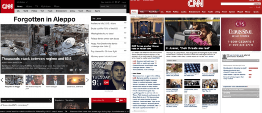
So, what went wrong after a new CNN website went live? Well, a lot! First of all, technical issues. The new website took about 20 seconds to load since they started using larger images. This also led to another problem – the website consumed 20% CPU to display its homepage.
To add to the technical issues, there were several usability issues as well. The emphasis on larger images resulted in fewer headlines appearing above the fold, thus displaying less content than before and forcing people to scroll down a lot. This wouldn’t be a problem should the load time of new content wasn’t such a pain. Some readers also reported the navigation was not intuitive at all.
Rob Griffiths in his article goes into more details comparing new and old CNN website designs. His verdict on the website redesign, “Pretty? Sure. Usable? No.”
Target
In 2009, Target decided to part ways with Amazon, ending their decade-long relationship. The retailer wanted to regain control over its online sales. Two years later, in 2011, Target presented a new website design.
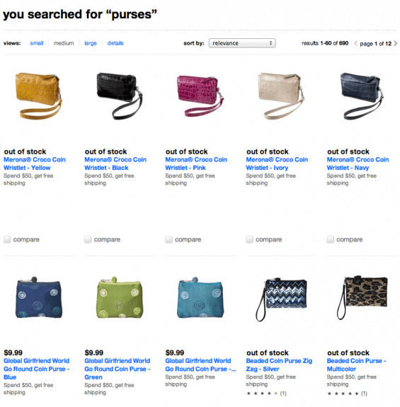
As we saw in the example of Marks & Spencer, two years of website development doesn’t guarantee success. There were many usability issues with the new website that led to customer’s disappointment.
Since when it is a good practice to show “out of stock” products first?
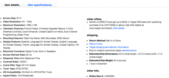
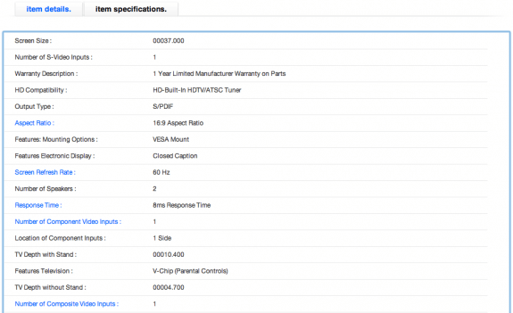
Item details vs. Item specifications, what’s the difference?
AdSense? Really?
So, why after two years of development a new website was riddled with so many basic but unforgiving errors? Well, in the press release Target revealed that more than 20 technical partners had been working on the development of a new website. That’s far too many. Miscommunications could happen since different companies were working with different parts of the website. Lack of testing considering how many issues were on a rookie level.
What saved Target from a big disaster is their chain of brick & mortar stores around the country. Had they been an online store only, their losses could have been more significant.
What Should We Learn From Redesign Failures
Most of these websites went through radical redesigns, which are often referred to as revolutionary redesigns. We’ve seen many companies apply these revolutionary redesigns in the recent years, often resulting in traffic drop, conversions decrease and eventually profit losses.
Following aspects contribute to failures in revolutionary designs:
- Confusion. When you roll out a new website, your customers are confused. There are simply too many changes at once that make them freeze and figure out what to do. You ask them to learn a new user interface from the beginning, and it is not why they visited your website. It’s like you were going to buy a new chair and someone started to teach you how to make one.
- Aesthetics. Most designers are obsessed with typography, color palettes, and other aesthetic elements of the website. They overlook actions that users take on your website, which brings us to the next point.
- Lack of user feedback. Without proper testing and valuable feedback from your core audience, you simply design in a vacuum. So it becomes impossible to predict what’s going to happen when you roll out your redesigned website.
- Analytics. No matter whether your redesign is a success or a failure, you will never know which decisions led to changes to purchases, downloads, sign-ups, etc.
- Gut feeling. Don’t even have to comment on this one; it’s a big NO-NO! The redesign should be treated as a strategy. Don’t listen to your gut feeling or over rely on design “best practices.”
- Time. As we saw, no matter how long your website was in design & development stage, or how many people worked on it, this is not a recipe for success.
How To Avoid Redesign Failures
Now that we know which factors contribute to website redesign failures, what do we do to ensure our new website rolls out smoothly?
The answer to this question is evolutionary design. There are many benefits to evolutionary approach:
- Risk management. By introducing incremental changes and constantly testing them you reduce the risk of failing.
- Focus on analytics. When you place focus on data analysis of the design changes you take control of crucial user engagement metrics such as conversions, sales, etc. Data analysis eliminates the guess factor. You can now tell for sure whether an update contributed to the increase or decrease of certain KPIs.
- Speed. Small incremental updates can be tested and applied in a short period compared to big radical changes.
- The power of user feedback. Designing for an end-user rather than designing using “best practices” and gut feeling is the way to go. Always concentrate on getting feedback from your active users, so you know how to serve them better.
Words of wisdom: If you decided to do a redesign of your website, do it right, do it evolutionary. Learn from the mistakes of others rather than your own, because they might be very costly to your business.
An elaborate redesign in an exceptional solution to old problems, if only it’s not too late. Check out While I Was Redesigning a Boarding Pass, Paper Got Old.
If you’re tired of redesigns just like me, have fun reading Don’t Listen to Users and 4 Other Myths About Usability Testing. Even if you’re not into usability, it has some amusing pictures.
About the Author
Andrew is a content manager & usability consultant at Icons8. He started his career as a phone support specialist, telling jokes while customers were rebooting their computers, then moved to usability testing and professional writing.